Type Journal week 8, Poor Kerning
For this weeks journal I chose a poster that is hanging in my friends house. I think that the type is spaced too far apart all together but more so in between the R and the A and the A and the T in the first word. It makes the A feel like its kind of hanging by itself. The A in the second word also feels a bit lonely and could be pulled closer on both sides. I think the designer seemed to have a problem with their A's.
Thursday, October 22, 2009
Thursday, October 15, 2009


This weeks type journal is about bad typography. I chose this poster that is hanging up at my work. We got it about two months ago to encourage the Agents to do well so that they may get a spot for the trip to Hawaii. The reason I chose this is mainly the tag that reads "paradise found" The word paradise isn't too bad by itself but than found is done in that horrible outlined type and what I think makes it even worse is that the words are touching each other in a strange way. The D on top of the F is making a wierd shape as well as the rest of the letters. When I walk by it from a distance these strange shapes always catch my eye and they really bother me. I just want to go in and add some leading and than I think I would feel better about it. I would also take away the outlined type and maybe just make it a little bolder than the other type.
Thursday, October 8, 2009
Week 6 Good type


This week I found my source material in the halls of the Sheradin building.
I like the type on the left because of the simple san serif font that was chose, I think it goes well with the dimensional drawing. But I Really like the type on the right. I think it is visually grabbing and flows well with the idea of the poster. Dimension is created with the type and makes for a captive poster. I love how the word Liquid is layered in two different fonts and colors. The only part I do not like is the type that curves across the middle in the water. Something about it being the only curved type makes it feel strange to me, but other than that the red type against the blue makes a nice contrast and the different textures of type are very nice.
I like the type on the left because of the simple san serif font that was chose, I think it goes well with the dimensional drawing. But I Really like the type on the right. I think it is visually grabbing and flows well with the idea of the poster. Dimension is created with the type and makes for a captive poster. I love how the word Liquid is layered in two different fonts and colors. The only part I do not like is the type that curves across the middle in the water. Something about it being the only curved type makes it feel strange to me, but other than that the red type against the blue makes a nice contrast and the different textures of type are very nice.
Thursday, October 1, 2009

Natural occuring typeface for week 3.
I found this handwritten type on a mailing that came to my work on September 30th.
I chose this because of the irony behind the mailing.
I work at a financial firm where the reps make a ridiculous amount of money and then this mailing comes on literally a lunch bag. The reps absolutely recieve many free lunches, but most things that come in to the business are fancy and are aimed to appeal to the upper class. I find the humor behind this simple brown paper bag with handwritten type on it where I'm sure many do not only because I am at the bottom of the feeding pool and I am also in college trying to pay for a better life.
Thursday, September 17, 2009
week 3 typography journal
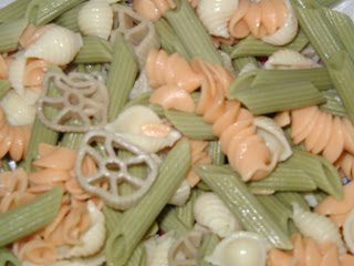
For the first week I found a letter K in my pasta.

I was inspired by books that my kids have where the author/artist takes fruits and vegetables and turns them into everyday scenes, like a carrot man driving a cucumber car. So I opened up my refrigerator to find letters in the food. Now to find the letter K you have to look at the pinwheel pasta. I know its a strange K because it has a circle in it, but like I say, I was inspired by kids books. This pasta was made on Saturday for dinner at my house and since it wasn't all eaten found its way into my homework.

I was inspired by books that my kids have where the author/artist takes fruits and vegetables and turns them into everyday scenes, like a carrot man driving a cucumber car. So I opened up my refrigerator to find letters in the food. Now to find the letter K you have to look at the pinwheel pasta. I know its a strange K because it has a circle in it, but like I say, I was inspired by kids books. This pasta was made on Saturday for dinner at my house and since it wasn't all eaten found its way into my homework.
Subscribe to:
Posts (Atom)
